Posts tagged capitalism

Putting Things Into Perspective – Top 1% Average Wages vs Others
Sep 30th
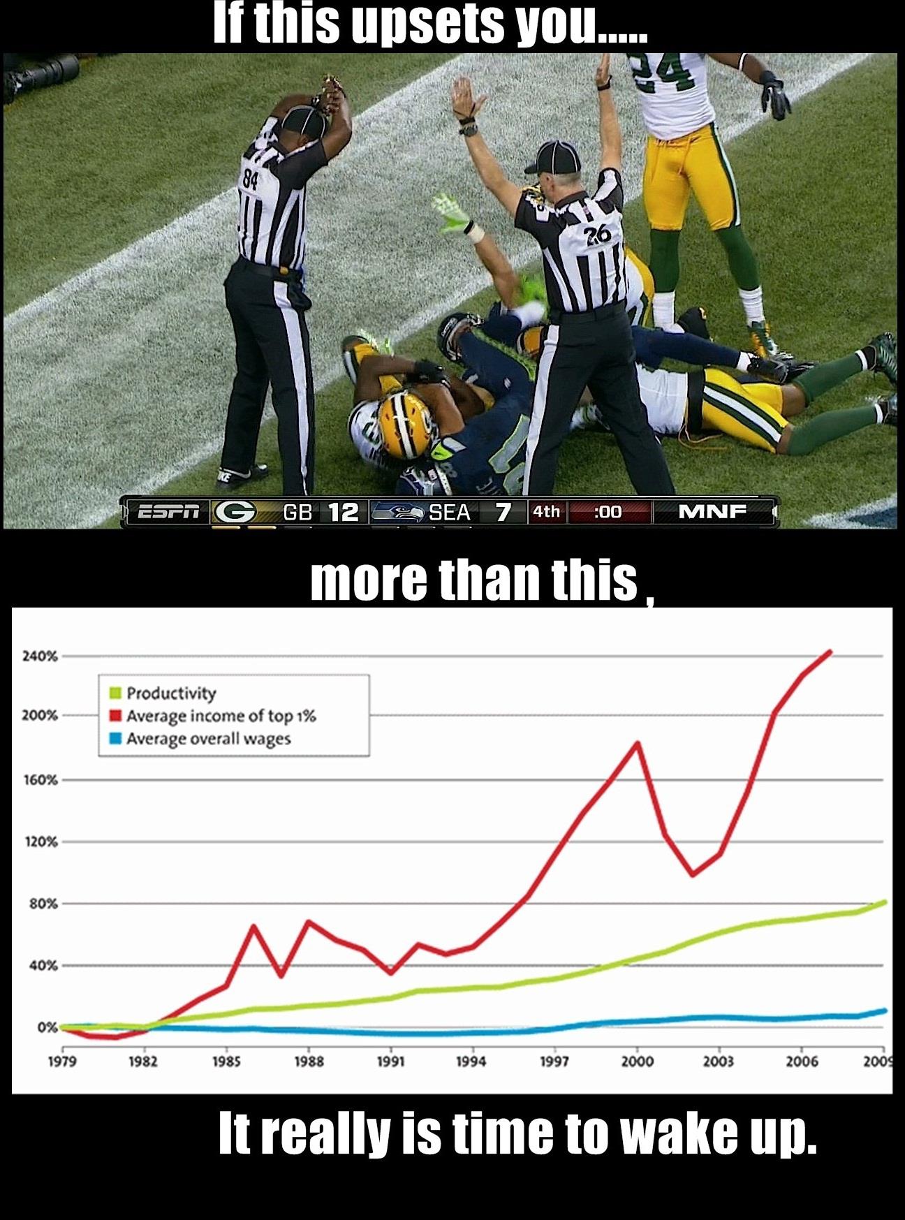
A friend recently shared this photo on Facebook from the Reaganomics, Raping America since 1981 Facebook Page that engaged me in further thought.
The photo was posted with the following listed as raw data sources: http://www.census.gov/
I took an interest on the statement the photo was proposing and further research caused me to respond.
First off… to be honest I’d say that I’m a moderate that slightly leans conservative but it really depends on the subject. When it comes to earnings, I’m a believer that we must take self-responsibility for our wealth. In the same light, the greater the risk the greater the reward should be.
Overall I couldn’t find a chart like the one posted in the photo in the raw data sources. I did find a similar chart in a recent news publication that for some reason used the “mean” of top 1% and the “median” of overall wages to compute the chart. There’s a big difference between mean and median. The fact that two methods were used to represent data in the same chart is misleading. Why is this important? Because even in the top 1%, there’s a big skew. According to Forbes, in the US, the richest person’s net worth is $66B; that’s almost 3x as much as the 10th richest. A median computation would take into account this kind of skewed data… a mean would not. I’m sorry, but this chart is misleading.
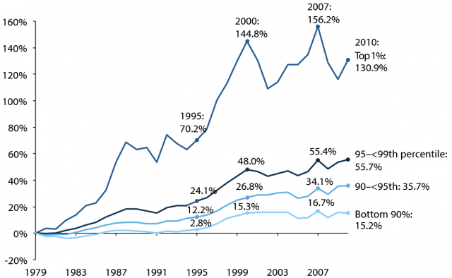
However, I’m not dismissing the general statement of this graph that top earners have had a greater increase in revenue than average households. I feel that further analysis is required to form a solid conclusion on the why. For example, the charts only take into account wages/earnings and not benefits (health insurance, vacation, expense accounts, etc) Nonetheless, greater risk should come with greater rewards. Let’s reference a chart found in the same source mentioned in raw sources (www.stateofworkingamerica.org) which shows a similar pattern as the graph in the first chart but the top line is not skewed. In addition, the later percentages are compounded by earlier years. I would like to take a relative measure to prove a point… from 2001 to about 2002, the top 1% had a decrease of about 30% in earnings while the <90% had no change in their wages. From 2000 to 2007, top 1% only had a 1% increase in earnings while <90% had a 9% increase. From 2007 to 2009, top 1% had a decrease of 16% while <90% had a decrease of 9%. In the lost decade, from 2000 to 2010, top 1% had a decrease of 9.5% in annual revenue while <90% had lost less than 1% (pretty much no change). I’m not denying the fact that top 1% have increasingly earned more, but the fluctuations for the top 1% are greater. Top 1% earners tend to be heavily invested in businesses and markets. These investments inherently carry great risk of potentially losing capital. <90% have the benefit of greater stability… you know that next year you’re not going to have a 30% decrease in your salary. I’m not saying it doesn’t happen, due to layoffs and salary reductions, but the possibility of it happening are less than the risk investors take. For example, in the Facebook IPO, those investors have lost about half. Imagine a top 1% making a $500,000 investment and within 6 months, losing $250,000.
I’m not outright defending one position or the other, but I feel that better context and analysis is needed when viewing these graphs. For example, productivity is highly influenced by the adoption of technology which would have an impact on business revenue and thus increase the earnings for investors but not so much for the employees.
Some might wonder why I’m defending the Top 1%. At heart, I’m an entrepreneur and capitalist. It’s not so much that I’m defending the top 1% as it is that I’m defending the principles of capitalism. A lot of what I’ve mentioned is impossible to communicate through just one graph. It’s something that requires in-depth analysis and discussion.
I encourage discussion of opposing views on political topics because through that process we learn, grow, and progress. Unfortunately our political system has broken down to one-liners, taking things out of context, and shock tactics which undermines understanding and growth. I blame both political parties for the mess we’re in. It seems that compromise and understanding has yielded to extreme polar opposite stances and exaggerated claims in order to fulfill political agendas.
